2.15.0 is live


RELEASE NOTES
1. New Features
1.1 Reports: Standard report for quick tasks and logs
The product now includes a standard extraction report for quick tasks and logs. Previously, this functionality only existed for scheduled tasks and native category screens, used to extract information from created items.
The standard report automatically brings all data columns available on the screen, without requiring the configuration of a report model. It is the ideal option when you need a quick and complete extraction, without building anything from scratch.
In practice, this works as follows: on the Quick Tasks or Logs screen, click the report button in the upper right corner and select "Standard Report". A notification appears at the top with a link to the MyReports screen, where you can download the generated file.
📋 Step by step: Standard report extraction for quick tasks and logs
On the Quick Tasks or Logs screen, click the Reports icon in the upper right corner

In the dropdown that opens, click "Default Report"

Select the desired export format: Excel, CSV, or DBF

The system will display a notification informing that the report is being processed. In the notification, click "My Generated Reports" to be redirected to the reports screen
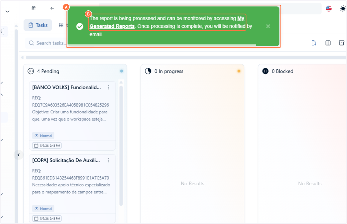
On the reports screen, you can access all generated reports

On the report you want to download, expand the actions menu and select "Download"

Want to learn more about quick task reports? See the documentation.
1.2 Dashboard: Advanced color configuration
Now you can customize the order and colors of dashboard charts. This resolves the limitation where fields appeared in random order and default colors could not be changed.
In practice, this works as follows: in the chart configuration, you can define a fixed order for fields (for example, Bad, Regular, Good, Excellent) and assign a specific color to each (red, orange, blue, green), making the visualization more intuitive.
📋 Step by step: Advanced color configuration
Access the "Data Grouping" tab, choose a reference category and define the chart grouping fields

Select the "By Range" coloring mode

Click "Add" to create a new range

Define the start (From) and end (To) of the range
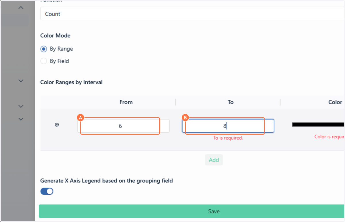
Choose the color for the range

View the result on the dashboard with the colored ranges applied

In "By Field" mode, enter the field value

Choose the color for the field

View the result on the dashboard with the colored fields applied

🗺️ Guided navigation: Advanced color configuration
Important:
You can navigate by clicking the areas circled in orange or by the arrows in the bottom right corner of the interactive area.
Want to learn more about dashboard configuration? See the documentation.
1.3 Dashboard: Chart axis ordering by option value
Now you can define the ordering of chart axes independently of the displayed values. This makes it possible to sort a chart following an alphabetical or numeric sequence.
For example, when creating or editing a chart based on a fixed list of options with months of the year, you can sort your count chart based on the value of each option. If the values are alphabetical (for example, label "January" with value "january"), the ordering follows alphabetical order. If the values are numeric (for example, label "January" with value "1" and label "December" with value "12"), the ordering follows ascending numeric order. This ensures that January always appears before December, regardless of data volumes, as long as the option values are configured in the desired sequence.
📋 Step by step: Chart axis ordering by option value
On the configured dashboard, notice that the chart is sorted by the number of registered items

In the upper right corner of the chart card, click "Sort Ascending" to reorder

The ordering will follow ascending order based on the field value — numeric if values are numbers, alphabetical if values are text

You can also sort in descending order by clicking the corresponding button

The chart will update automatically with the new descending order

Want to learn more about dashboard charts? See the documentation.
1.4 Users: Confirmation when resending bulk invites
The product now displays a confirmation popup when clicking "Resend all" in the invite resend modal. This prevents the accidental sending of invites to multiple users.
📋 Step by step: Bulk invite resend
In the left sidebar, click on "Access" and then on "Member Management"

If there are pending invites, a banner will appear at the top of the page

In the invite resend request banner, click "View all"

In the pending requests list, choose to resend a specific invite or, if there is more than one, click "Resend all"

Confirm the resend in the confirmation popup

Want to learn more about invite resend? See the documentation.
2. Improvements
2.1 Fields: Rich text and images in the Chat field
The Chat field now supports text formatting and image insertion via copy and paste. This brings the Chat experience closer to the resources already available in HTML fields, enabling clearer and faster communication.
The available formatting options are: bold, italic, underline, structured line breaks, and lists. For images, simply copy a screenshot or file from the clipboard and paste directly into the field with Ctrl+V, without the need for manual upload.
📋 Step by step: Using the Chat field with rich text
From the left-side menu, access the category that contains the Chat field and open an item for editing

Then, open an item for editing

In the editing sidebar, locate the Chat field

In the field toolbar, click the formatting icon to activate rich text mode

Type text and apply formatting (bold, italic, lists) using the toolbar

Copy an image and paste it into the field using Ctrl+V

Click the send button to publish the formatted message

The formatted text and image will be saved in the chat history

🗺️ Guided navigation: Chat field with rich text
Important:
You can navigate by clicking the areas circled in orange or by the arrows in the bottom right corner of the interactive area.
Want to learn more about the Chat field? See the documentation.
2.2 Spaceflow: Branch separation in OR/AND conditionals
The Conditionals component, used in Start, Conditionals, and Routes nodes, now includes the Separate Branches option.
Before, all conditions filled in the "OR" and "AND" branches were treated as a single AND logical group, joining rules that should function independently.
In practice, this works as follows: when filling conditions in both branches (OR and AND) and activating the "Separate Branches" toggle, the system calculates each branch separately (conditions within the OR branch combine with each other via OR, and conditions within the AND branch combine with each other via AND) and then joins the result of the two branches via OR.
This allows building combined logic such as "Red OR (Purple 1 AND Purple 2)", which was previously impossible because everything was interpreted as a single AND group.
📋 Step by step: Separating branches in conditionals
With the Spaceflow editor open, access a Start, Conditionals, or Routes node

Notice that there are two branches available: OR Branch and AND Branch

Fill in the desired conditions for one branch or both

Enable the "Separate Branches" toggle

Click "Save and close" to apply the new conditional logic

🗺️ Guided navigation: branch separation in conditionals
Important:
You can navigate by clicking the areas circled in orange or by the arrows in the bottom right corner of the interactive area.
Want to learn more about Spaceflow conditionals? See the documentation.
2.3 Form builder: Option to disable field editing
The form builder now includes the Disable editing option in the settings for each field. It resolves a limitation of "read-only" mode, which until then was used to prevent manual editing but also blocked the saving of data inserted by events or automations.
The difference between the two modes is as follows: read-only mode functions only as a display — the field shows information but does not save any data inserted by automatic action. The Disable editing option blocks only manual editing by the user, keeping the field able to receive and save data coming from events, automations, or any other automatic action configured in the system.
In practice, this works as follows: if field B has an event configured to receive data whenever field A is edited, enabling "Disable editing" on field B ensures that the user cannot change the value manually, but that data inserted by the event is saved normally when the item is saved.
📋 Step by step: Disabling editing for a field in the form builder
In the left-side menu, click on "Structure" and then access "Types"
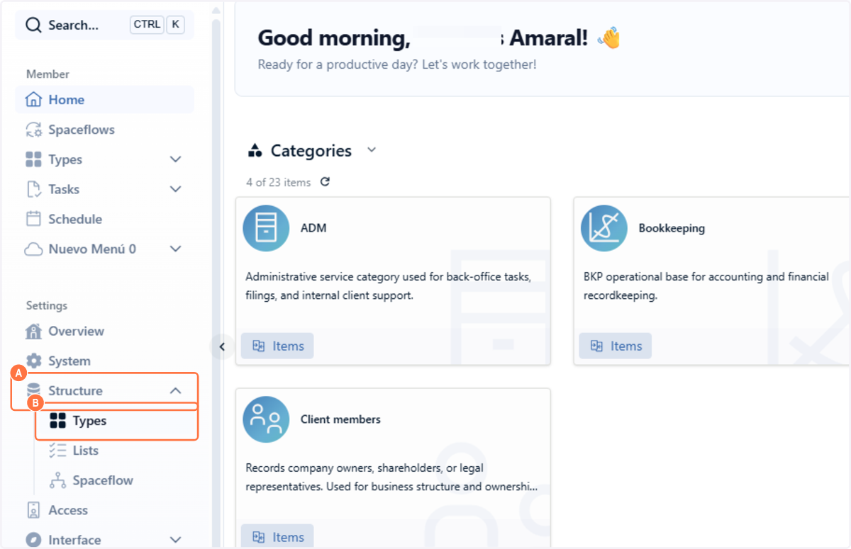
Select the desired category and click on "Forms"

Click the actions arrow for the desired form and select "Access"

In the form builder, click the settings button at the bottom of the desired block

In the dropdown menu, select "Settings"

In the modal window, locate the "Disable Field Editing" option and enable it

Click "Save"

Want to learn more about field settings in the form builder? See the documentation.
2.4 AI: New features banner on new screens
The product now displays the new features banner on screens launched for the first time. Previously, the banner only appeared on existing screens that had been modified. Currently, the screens considered new are: AI Agents, Logs, Credentials, and Releases.
Unlike improvements on older screens, the banner on new screens does not display the "revert to previous version" button. It keeps the "Learn more" link, which directs to documentation, and the feedback button, which records ratings and comments directly in the platform admin.
Want to learn more about the new features banner? See the documentation.
2.5 Spaceflow: Support for boolean values in conditionals
The Spaceflow rule builder now allows comparing boolean fields directly with true and false values. Previously, it was not possible to use the Equal (===) and Different (!=) operators with boolean-type variables, which prevented the creation of branches based on true/false fields.
In practice: when configuring a conditional, you can select a boolean field (for example, "Approved") and compare its value directly with true or false using comparison operators. For example, the rule "If Approved === true" directs the flow to a specific path when the "Approved" field is true, while "If Approved === false" directs to another path when it is false. This simplifies flow logic and makes rules more intuitive.
Want to learn more about Spaceflow conditionals? See the documentation.
2.6 Fields: Date formatting in quick task sidebar
The product now applies standard date formatting to date-type fields displayed in the quick task sidebar. Previously, the raw value returned by the system was displayed without a mask, making reading difficult.
Want to learn more about quick tasks? See the documentation.
3. Bug Fixes
When filling the recipient field in the Spaceflow email node, it was not possible to remove or delete the entered address.
The fix eliminates the blockage and allows removing the email from the field, enabling editing or replacing the recipient normally.
When filling a date field on the quick tasks screen, the value disappeared from the interface.
The fix ensures that the date field remains visible and functional after filling.
When typing {{ in the HTML field (used to insert long text in HTML format) within Spaceflow nodes to insert variables, the suggestion popup did not appear and it was not possible to select any variable.
The fix restores the variable popup when typing {{, allowing selecting and inserting available variables normally.
When configuring permissions in the Spaceflow CRUD node and selecting the Group or Role types, the Value field stopped being displayed, preventing the definition of the responsible party.
The fix ensures that the Value field appears correctly for all permission types, allowing choosing the group or role responsible for the task.
When using the search field on the Spaceflow executions screen, executions were not found when searching by reference.
The fix adjusts the search so that the field correctly locates executions by the reference value.
In the external task portal, tasks that had been deleted were still appearing on the user's dashboard even after cache update.
The fix ensures that deleted tasks are removed from the external portal dashboard, reflecting the current state in real time.
After migration, empty date fields in the customer environment appeared with the value 1899 instead of remaining empty.
The fix adjusts the handling of empty date fields during migration so they do not receive the default value of 1899.
v2.14.0 is live
This release includes 31 items: 5 new features, 13 improvements, and 13 bug fixes. Highlights include dedicated HTML formatting in the Spaceflow email node, task reports with form field columns, a language selector in the external task portal, the inclusion of the legal rate in monetary correction indexes, and the ability to request re-sending of expired invites.
v2.8.10 is live
This release includes 7 items in total: 2 new features, 3 improvements, and 2 bug fixes. Of these, 4 are deliveries requested by users and 3 are general product evolutions or fixes, conceived or requested by the technical team.